
Spryly
Services
Brand Creation
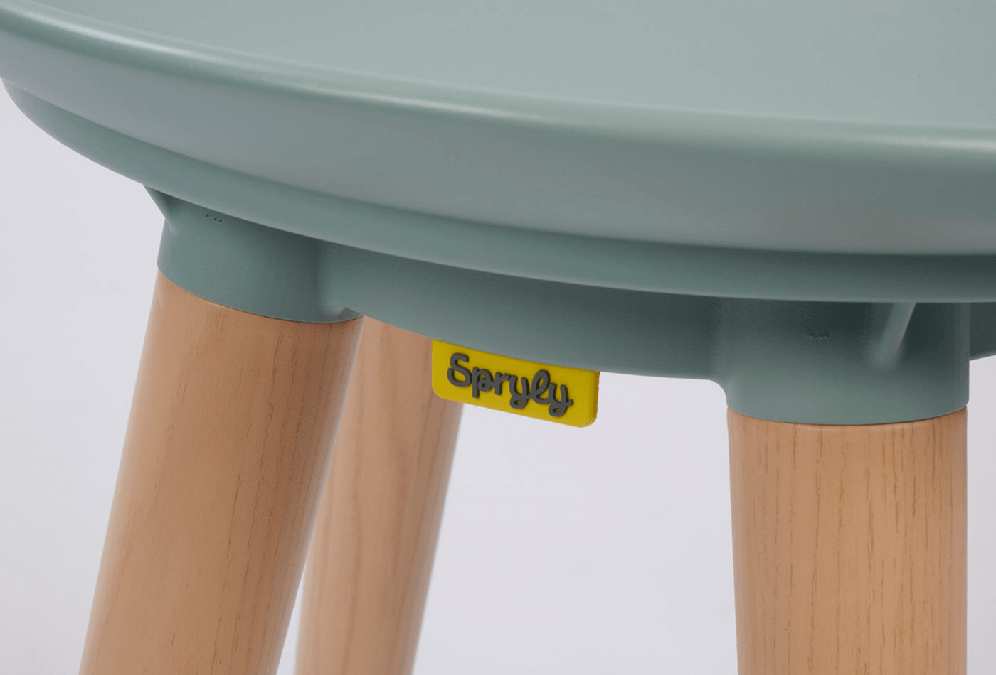
The founders of Spryly had a vision: to create a range of aids for daily living (ADLs) that not only made the end users' lives better but also blended into their home environment.
While there was a plethora of ADL’s on the market, there were very few that placed any real emphasis on aesthetics, with the majority of products looking more in place on a hospital ward than in a bedroom.
After working alongside the founders to establish their brand strategy we explored suitable brand names that worked alongside this. We were keen to arrive at a name that delivered energy and optimism while being easy to recall. The name also needed to be easy to pronounce in other European markets where the products would also be available.
After multiple rounds of naming proposals Spryly (active; nimble; agile; energetic; brisk) emerged as the frontrunner. It satisfied all of the requirements whilst also providing maximum stand-out in this sector.
The Design
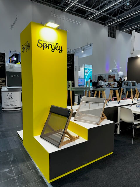
Our design approach matched the energy and optimism captured in the brand name. The wordmark has a fluid quality that nods to the movement and motion that Spryly brings. The ‘hand drawn’ feel adds warmth to the identity and humanises the brand. The freeness of the font also suggests a sense of carefree happiness.
The ligatures of the wordmark could then be abstracted and used as graphics, providing interesting backgrounds and acting as a further recognisable brand asset.

The Strapline
Our strapline ‘Designed for Life’ communicates our commitment to thoughtfully designing products which balance form and function to make every day easier.

The Tone of Voice
The tone of voice we developed for the brand married optimism (‘positive and confident, not forced cheerfulness’) with straightforward delivery and warmth (‘making things easy to understand, with a smile’). This then flowed through everything from print to online.


"Our business has worked with Bread & Butter Communications on numerous projects over the years. They are are a joy to work with and always come up with clever, great looking solutions to our design briefs. We highly recommend this agency!"

.png)


